For years, all-white kitchens have been the overwhelming favorite among homeowners, but in 2024, color is coming back in a big way to the heart of the home.
The trend is gaining momentum as homeowners seek ways to express more personality with their design and décor choices.
What’s the best strategy to include color in the kitchen? What colors contribute to décor longevity? How do you know how to mix and match? What’s trending? What if you are wary of too much color, after years of a clean, crisp all-white kitchen?
Here are some strategies on how to incorporate color according to comfort level, to create a kitchen to love for years to come.
Use the 60:30:10 rule
While design’s impact hinges on the sensory experience of the viewer, the strategy behind it is more formulaic, especially when it comes to including and mixing colors effectively.
Designers have a trick that ensures color balance in a space, where three colors are chosen and used in a 60:30:10 ratio.
The bulk, i.e. 60 percent of the space, is dedicated to the main color, while 30 percent is dedicated to a secondary, supporting color and the remaining 10 percent is an accent color.
In a kitchen, this might mean having a lot of the surface materials, such as the flooring, walls and counters in a neutral color, with cabinetry in a secondary color and accents, such as backsplash or décor pieces in another, complementary or contrasting color.
Which colors “go” with each other is really a matter of personal taste, but designers often start with the color wheel.
Also consider the size and layout of your kitchen when choosing colors, as well as the amount of light that will be present in the room, because this will affect how colors appear. With more natural light, you can generally afford to go darker without making a room feel boxy.
With bright and earthy colors trending, the concept of neutrals has shifted to include a varied palette, including blues, greens, corals, and traditional neutrals, such as whites, creams, yellows and beiges.
What are the most common kitchen color trends?
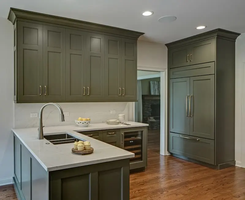
The color charge in the kitchen has been led by green of varying shades, from forest greens to emeralds, sage and olive-imbued hues.
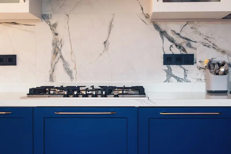
Another popular kitchen color is blue with a gamut of different shades, especially in cabinetry. Notably, most of the major paint companies had varying hues of blue in their Color of the Year picks for 2024, underscoring blue’s broad-based appeal and versatility.
“Blue is classic and will stand the test of time. It goes beautifully with white, jewel tones, beige, brown and taupe. You can really be creative, and I think that is why it is so appealing,” says color expert and consultant Amy Wax.
And there are some unexpected breakout colors as well, according to Gladys Schanstra, owner/creative director of Drury Design,: “Believe it or not, we are seeing pinks, blushes and similar neutrals in that family.”
While last summer’s Barbie sensation drove the resurgence of bubble-gum pink, more subtle shades of are making their presence known too.
“Trending now, you’ll see anything from neutral to heavy, dark pink accents, such as rugs or on the face or background of cabinets. Or you might also see a neutral pink as the hue for all of the cabinets,” says Schanstra.
Expressive tones such as “teals, and purple are out there as well. You’ll see these on Instagram, and a lot of winners of design competitions are using these,” she says.
Wood adds warmth
Also, trending is wood, reminding homeowners that painted colors are not the only option to infuse color. Wood has the added benefit of offering visual texture and interest, adding warmth to a room that is often full of cold, hard surfaces.
Wood grain patterns vary and are supportive to the details in the décor. Be sure to select complementary grains, which don’t necessarily require the same wood species, but rather tie together pleasing patterns.
Homeowners often choose hardwood flooring to run through the kitchen, but you shouldn’t necessarily have wood cabinets be the same color as the wood floor. Rather, contrast is preferable. If flooring is dark go for lighter tones or your cabinetry, or vice versa.
Wooden accents are popular and beautiful, like with beams, shelving or artwork.
Bespoke metallic accents
In the spirit of more personality and creating eye-catching spaces, homeowners are bringing bling, illuminating focal points with bespoke metal accents.
Copper, bronze, rose gold and silver are all lovely and luxe. Make a splash with a metal range hood or with metallic backsplash.
And don’t forget the décor potential of hardware.
“Hardware is huge,” says Schanstra. “Brushed gold is very popular at the moment, as is polished nickel, as nickel a little warmer than chrome,” she says.
Black-and-white all over
One spin on the all-white kitchen is the classic black-and-white color scheme. A benefit of these color choices is that they are timeless, so this approach offers design longevity for homeowners.
Homeowners can choose drama, with black walls and counters, or elegant, with white dominating and black balancing with focal points. Think black stainless-steel appliances and counters with dynamic black patterning.
Worried about too much color in the kitchen?
Homeowners may understandably be nervous to be bold after years of subdued kitchen palettes.
According to Schanstra, a combination of wood, off-white and a darker tone, such as charcoal, black or grey, is a comfortable segue towards more dramatic color choices.
“This trio of colors is applied in all sorts of ways. You might have a wood countertop and base cabinets might be dark, or vice versa,” she says.
“It’s a safe way to treat a kitchen that that’s not necessarily bringing in blues, greens or teals. But it’s not white. And it’s more classic and a good choice for people who might not want to go as bold,,” says Schanstra.
Or, a gradual approach to color can boost comfort level.
- Stay within the biophilic color palette, which includes a range of earthy tones. These color combinations are familiar, as they appear in nature, and tend to be on the subtle end of the scale.
- Pick colorful spots strategically. Paint inside cabinetry or the pantry in a bolder color to test it out. Or use the island as a bold, contrasting focal point.
- Rely on accents, such rugs, island seating or wallpaper to experiment with colorsA, without a huge commitment.
Design tips to keep resale in mind
Given the cost of renovating a kitchen, as well as the key role that it plays in setting the style tone for a home, and therefore in the perception of value for future buyers, it can be challenging to balance self-expression, while still being mindful of resale.
Homeowners with this goal, might stick to neutral hard surfaces, such as “permanent items such as cabinets, countertop and flooring,” says Schanstra, as these are more expensive and more work to switch out.
However, with the bold burst of colors recently, the neutral-is-best philosophy isn’t as prevalent as it once was.
‘People are getting tired of that neutral rule,” she says, indicating that homeowners instead are focusing on color implementation strategy, believing that future buyers will appreciate the artistry when properly executed.
The main priority for homeowners is, “I’m going to enjoy the space, so long as it’s well done,” she says.


